实验目的
掌握R语言中散点图矩阵的绘制
实验原理
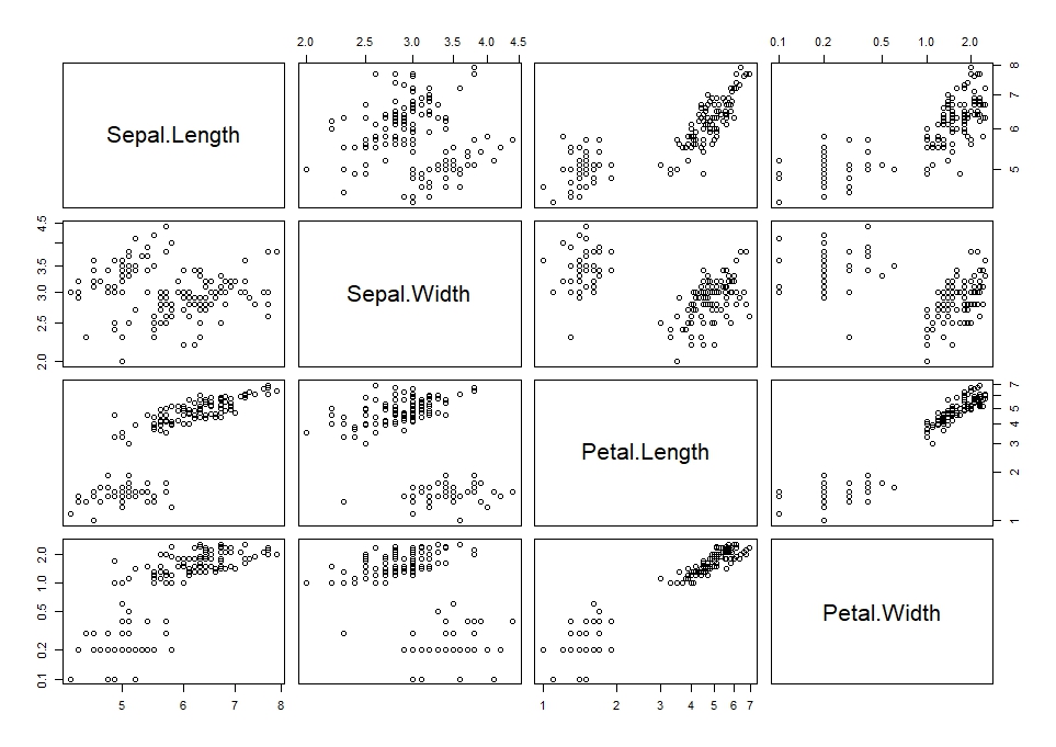
散点矩阵图可以展示数据集中多个变量间的属性,来探索它们之间的关系,放大它们之间的差异以及揭示隐藏的规律。渔夫的鸢尾花(Fisher’s iris)数据集包含50组鸢尾花的一些数据,包含花萼的长度,花萼的宽度,花瓣的长度,花瓣的宽度(sepal length, sepal width, petal length, and petal width)。这50组鸢尾花来自三个不同的品种:setosa,versicolor和virginica。
实验步骤
下面的散点矩阵图12比较了鸢尾花的四个变量(sepal length, sepal width, petal length, and petal width),三个品种分别用三种颜色标记。
> colors <- c("red","green","blue")
> pairs(iris[1:4],main="鸢尾花数据散点矩阵图",pch=21,bg=colors[unclass(iris$Species)])
> par(xpd = TRUE)
> legend(0.2, 0.02, horiz = TRUE, as.vector(unique(iris$Species)),fill = colors, bty = "n")

无颜色标注:
> pairs(iris[-5], log = "xy")
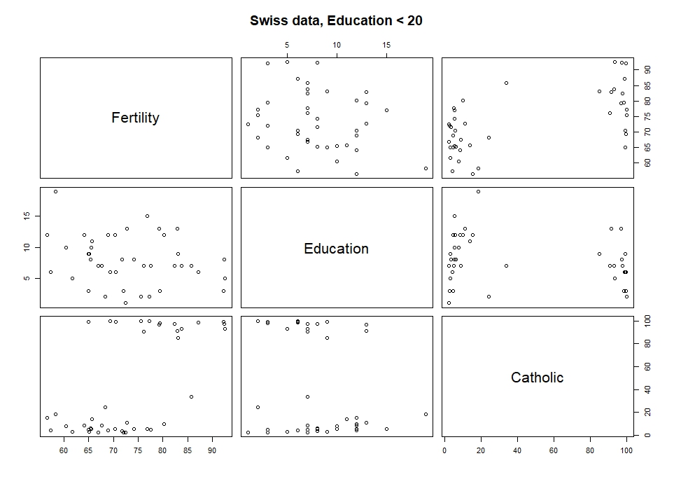
另一个例子:
> pairs(~ Fertility + Education + Catholic, data = swiss,
+       subset = Education < 20, main = "Swiss data, Education < 20")
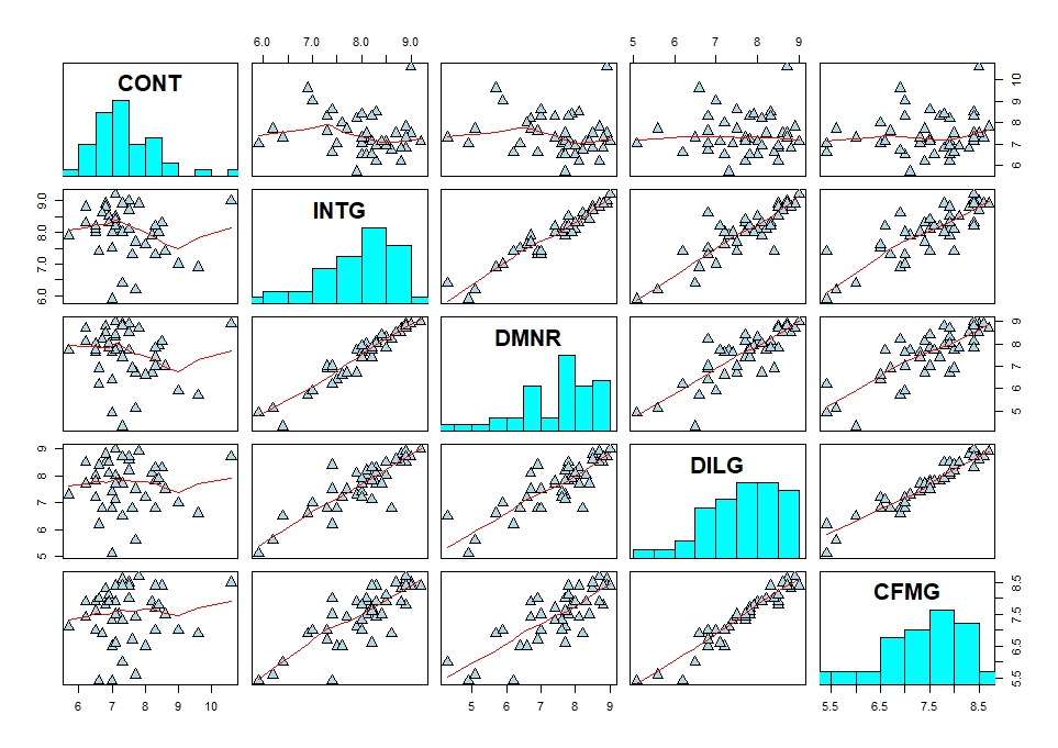
 另外可以改变散点形状并添加直方图:
> panel.hist <- function(x, ...)
+ {
+     usr <- par("usr"); on.exit(par(usr))
+     par(usr = c(usr[1:2], 0, 1.5) )
+     h <- hist(x, plot = FALSE)
+     breaks <- h$breaks; nB <- length(breaks)
+     y <- h$counts; y <- y/max(y)
+     rect(breaks[-nB], 0, breaks[-1], y, col = "cyan", ...)
+ }
> pairs(USJudgeRatings[1:5], panel = panel.smooth,
+       cex = 1.5, pch = 24, bg = "light blue",
+       diag.panel = panel.hist, cex.labels = 2, font.labels = 2)
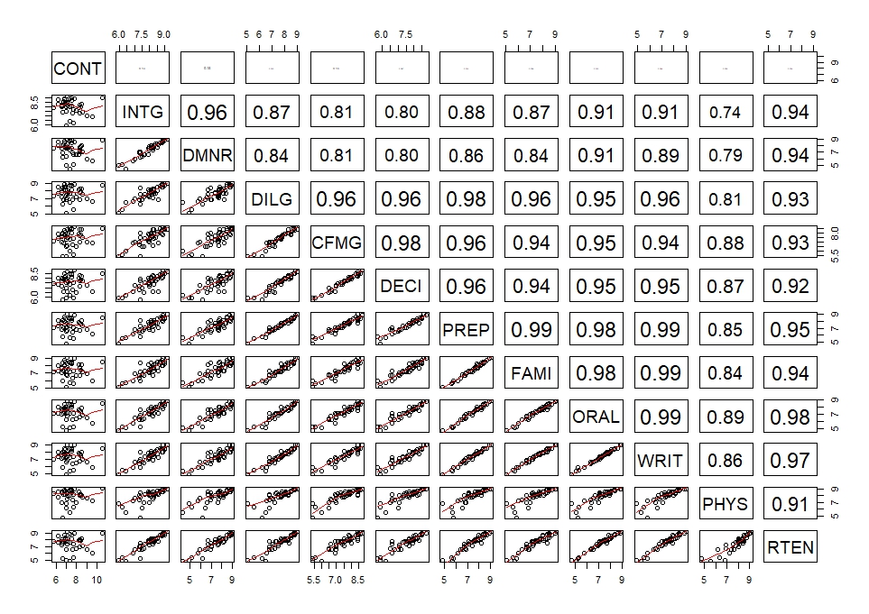
 在散点图矩阵中添加回归系数:
> panel.cor <- function(x, y, digits = 2, prefix = "", cex.cor, ...)
+ {
+     usr <- par("usr"); on.exit(par(usr))
+     par(usr = c(0, 1, 0, 1))
+     r <- abs(cor(x, y))
+     txt <- format(c(r, 0.123456789), digits = digits)[1]
+     txt <- paste0(prefix, txt)
+     if(missing(cex.cor)) cex.cor <- 0.8/strwidth(txt)
+     text(0.5, 0.5, txt, cex = cex.cor * r)
+ }
> pairs(USJudgeRatings, lower.panel = panel.smooth, upper.panel = panel.cor)